The Joy is in the Journey

Hello everyone!!  I’m here today with Papertrey Ink’s Make it Monday #171: Pop Up Die Cuts, AAA Cards Game #10 Watercolor techniques and Virginia’s View Challenge #5

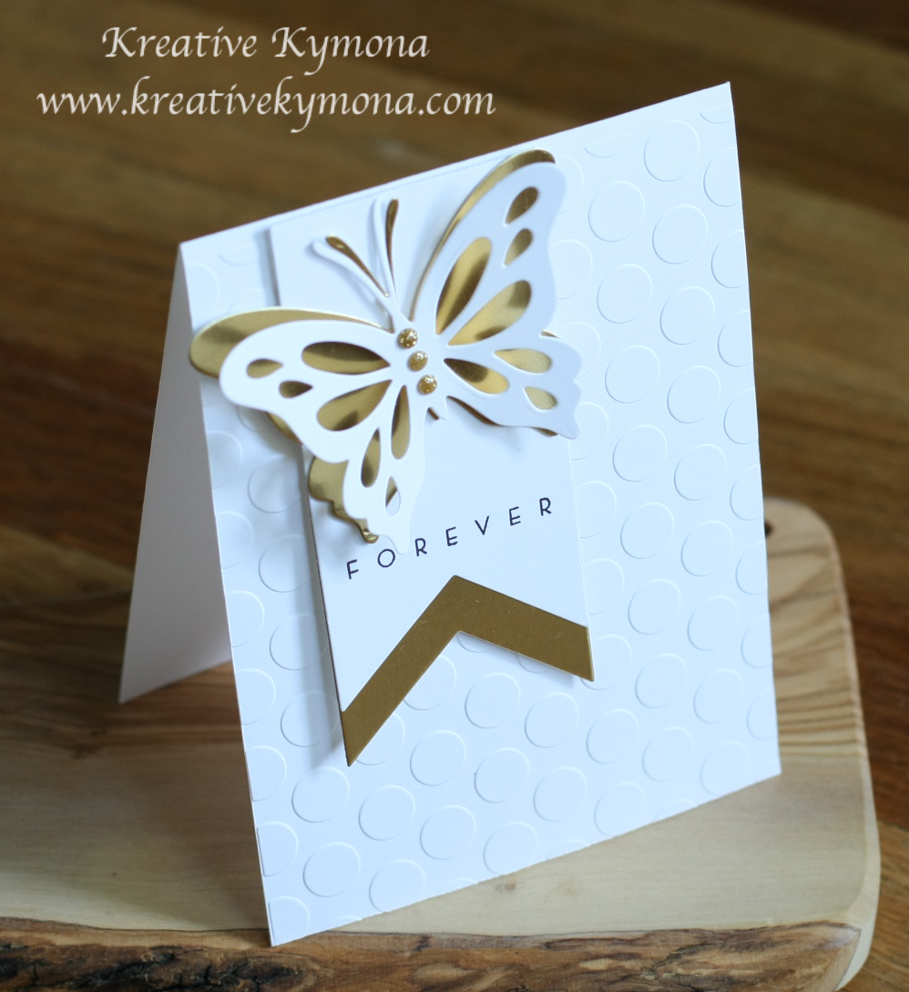
I’m so excited about this weeks challenges because they combine my two favorite things.  Water-coloring and my all time favorite die, Life is Beautiful Butterfly die.

AAAcardGame10

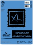
Yayyyyy, I get to use Watercolors for this challenge!!

MIM 171 Pop Up Die Cuts

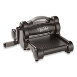
Besty Veldman showed everyone how to use our dies to create partial cuts!!

V. V. Challenge #5 (2)

Die Cut, perfect!

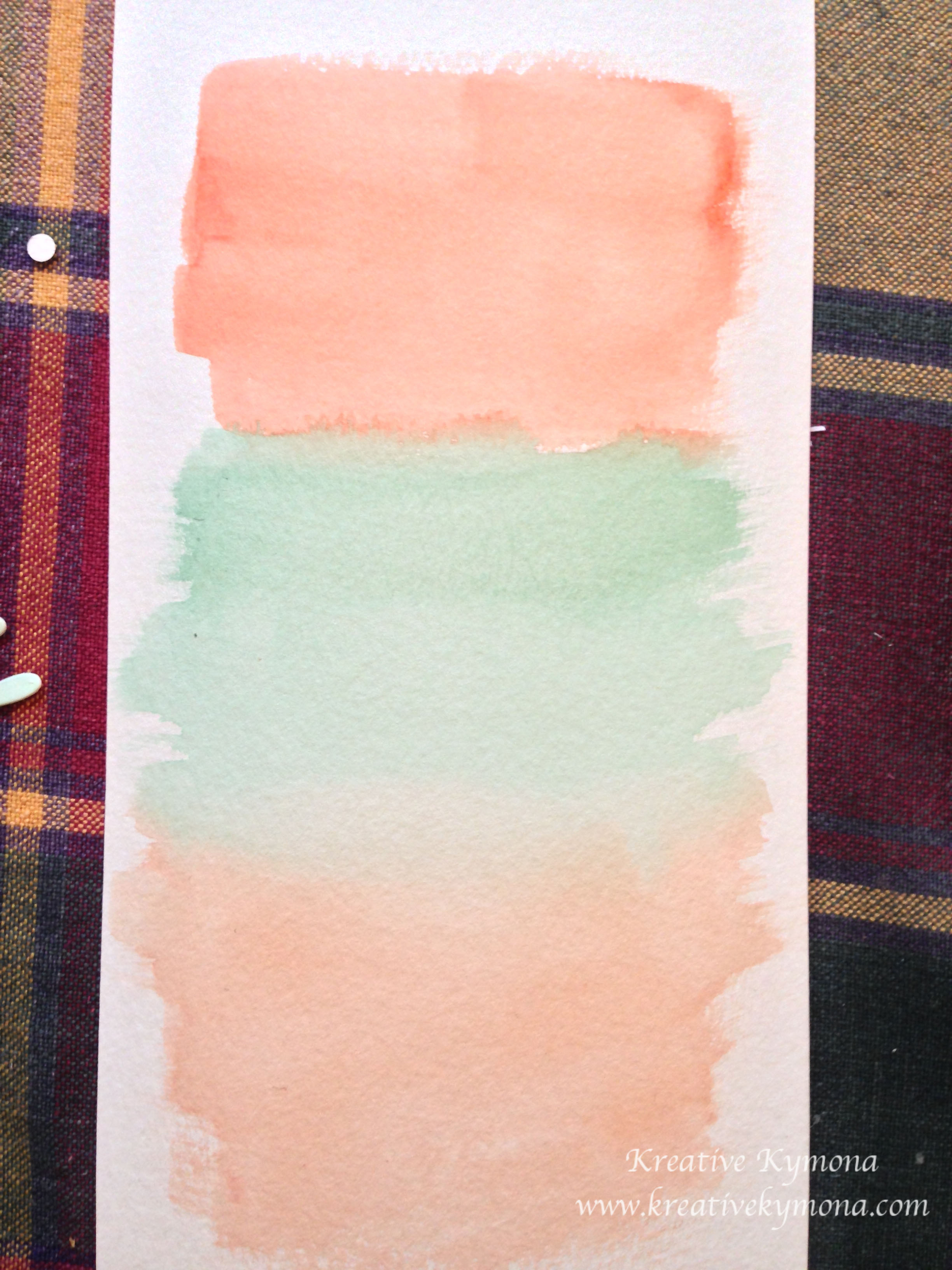
Take a look at my card:

Joy in the Journey3

Joy in the Jouney4

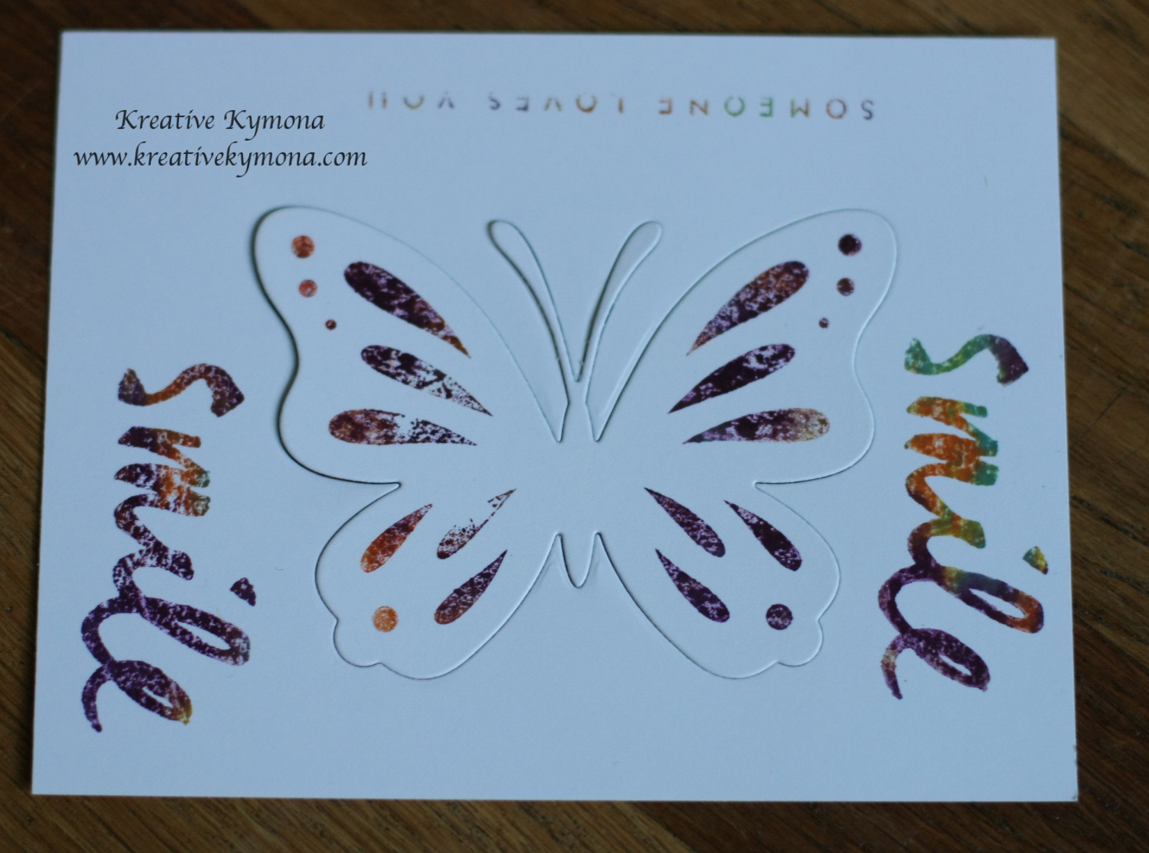
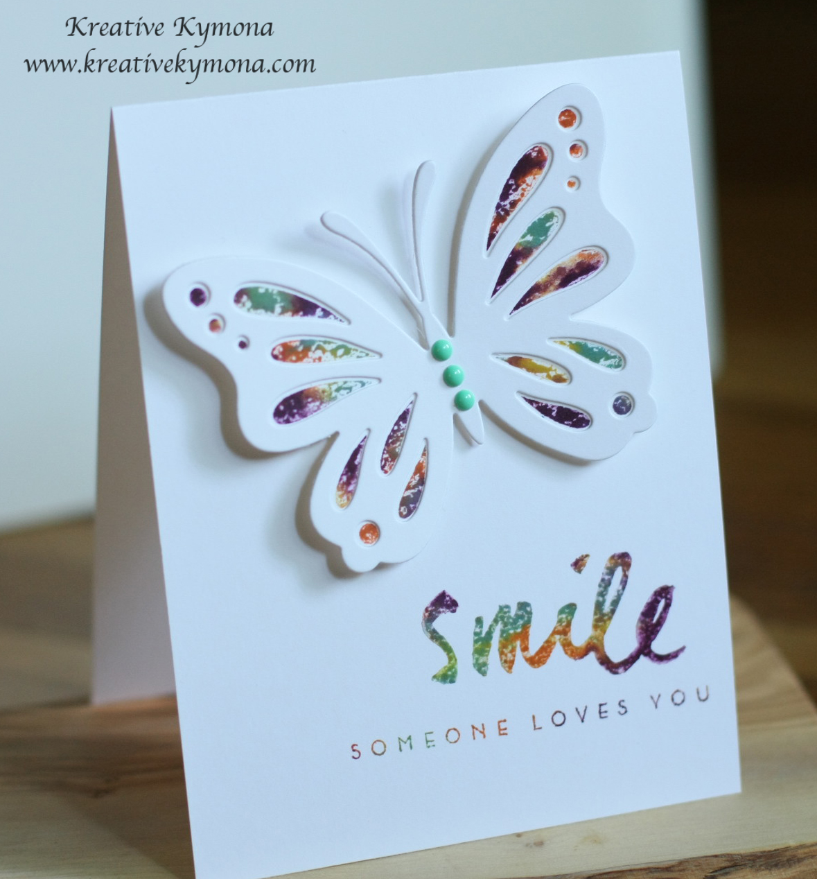
I created a card like this in the past, when I was taking my Online Card Class on Water-coloring.  It was fun so I decided to do it again with different colors, die, and sentiment.  You can see my original card here.

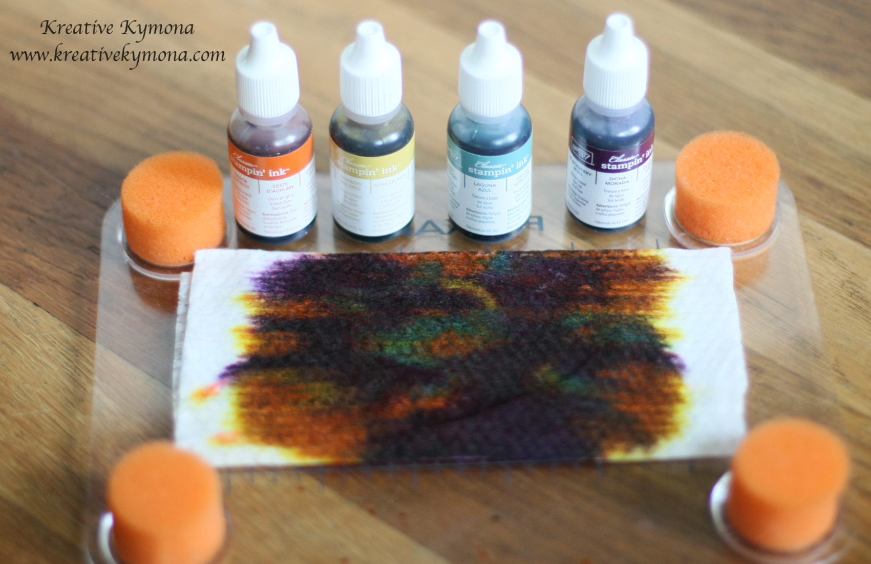
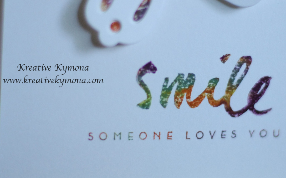
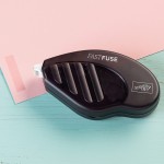
To create the watercolor dots, I used a new pencil eraser to transfer the ink from the pad to the paper.

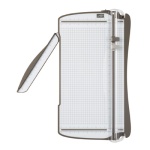
Then I die cut the butterfly over the dots.  I only placed the cutting plates over the wing section of the butterfly.  That way the body of the butterfly will stay in tack.

I stamped the sentiment and added some heart enamel dots.

Can you say pretty!!!  I can!!!  Creating this card was very easy and everyone should try water-coloring and partial die cutting.

So what do you think?  Please leave a comment letting me know if you like my card creation today.

Supplies use:

Life is Beautiful DieAqua MistPTI Summer Sunrise InkSIGHTSEEINGCN Enamel heartsOnyx Versafine InkTiconderoga pencilclassiccrestsolarwhtieStampin' TrimmerFuse Fast Adhesive

Thank you for stopping by and visiting me!

~Kymona

Pop of Color!

Third Post for the day!

Hello everyone! I’m back again today for the third time.  Can you tell I’m having fun!!!  Yes, I was up late last night playing around with my stamp supplies in my little stampin corner.  I created a couple of watercolor backgrounds and I knew I need to use one of them for my next card.

I’m here this evening with CASology.  They are celebrating their 100th challenge and all of the friendships they’ve made throughout this time.  I wanted to join in on this celebration so I created a card celebrating them!

Week 100 - Celebrate

So the cue word is CELEBRATE!!  So fitting for this great accomplishment.

Here is my clean and simple card:

Celebrate

I love how the gold matches the watercolor background.  I decided to use black ink for the sentiment because I wanted it to stand out from the background.

What do you think?

Supplies used:

Life is Beautiful DieWet Paint 3Hello Honey ReinkerGold Foil SheetsOnyx VersafineWe R Memory Keepers Corner ChomperCanson Watercolor PaperStampin' TrimmerFuse Fast Adhesive

I also used Stampin’ Up!’s Retired Primrose Petal re-inkier to create my watercolor background.

Thanks for stopping by!

~Kymona

Forever Elegant…

Hello everyone!  It’s been 4 days since my last post.  I’ve been so busy that I haven’t been able to sit and talk to all of you.

I’m here today with CAS(E) this Sketch #81.  They have done pairing up with Fusion this week for an amazing joint challenge that is very pretty and elegant to me.

CTS_Fusion

I decided that I wanted my card to be elegant and very clean and simple.  I’m so glad to see a butterfly in this sketch because PTI Life is Beautiful die is my favorite die to work with.  The butterfly is very elegant to me.

Take a look at my interpretation of the sketch:

Elegant Forever

So what do you think?  I just love how my card came out.  The gold is and white looks great to me.

Supplies used:

Life is Beautiful DieLife is Beautiful Stamp SetGold Foil SheetsLifestyle Crafts Spotted Embossing FoldersclassiccrestsolarwhtieOnyx VersafineBanners Framelits DiesMME Charmed Enamel DotsStampin' TrimmerStampin' DimensionalsBig Shot Die-Cut MachineMagnectic Platform

Thank you for stopping by!!

~Kymona

Are You One Of A Kind?

Hello everyone!  I’m back again today with another Papertrey Ink Make It Monday #168: Baby Wipe Stamping!!  I’m so excited about this Make It Monday.  Ashley taught us how to use baby wipes to do our multicolor stamping.  I had a blast with this technique today.

Take a look:

baby wipes and reinkers

First I added Stampin’ Up!’s new in colors to my baby wipe.  I randomly added the ink to the baby wipe.

teast sheet

I wanted to make sure my card looked a little different then Ashley’s, so I stamped my sentiment using the same baby wipe.  I used this piece of card stock as my scrap to make sure my stamps were inking up properly.  I love the colors on this butterfly and the sentiment.  Can you see how each stamp has different colors.  No two stamps are the same.

butterfly closeup

Closer look at my butterfly.  The colors are awesome!

sentiment closeup

Closer look at my sentiment. These colors are delicious.

Smile somone loves you

I absolutely love how my card turned out. This was such a great technique to try.  The look reminds me of water-coloring, which everyone who knows me, knows I LOVE water-coloring.

Supplies used:

Tangelo Twist ReinkerHello Honey ReinkerBlackberry Bliss ReinkerLost LagoonWet Paint 3Life is Beautiful Stamp SetLife is Beautiful DieUltra Thick White CS 120Big Shot Die-Cut MachineMagnetic PlatformStampin' TrimmerStampin' DimensionalsMME Enamel Dots

So tell me what you think.  I would love to hear from you.

~Kymona

What is Texture?

Happy Friday everyone!!! Today couldn’t get here fast enough.  The week was dragging and cold.  To keep my cool, I joined Addicted to CAS Challenge this week.  Their code word is Texture. How interesting!!  How often do you get a card with texture on it.  Think about it.

So, the question is what is texture?

According to Webster, texture is the visual and especially tactile quality of a surface.  For example a rough texture.

Well that is interesting, who wants a card with a rough texture.  When you think of cards, you think pretty, smooth, subtle, funny, and bright.  So how does texture play apart on a greeting card.

I will show you, take a look at the card I came up with.

Life

Can you say texture?  Yes, you can!! Guess what, it is rough!!!  It’s a pretty rough card!!

Life side

You can see the thickness of this textured butterfly.

Life close up

I saw Laura Bassen create a card like this and I wanted to give it a try.

1. I die cut 4 butterflies from Papertrey Ink’s Life is Beautiful die cut to create a butterfly stencil.

2. I attached the stencil to my white cardstock.

3.  I mixed two distress inks colors with embossing paste.

4. I spread a thick coat of the color embossing paste over my heart stencil.

5. Once I was done applying the paste, I lifted the butterfly stencil and WALA!!

Have you notice that one of my butterfly antenna’s are missing.  I think that is the beauty of this card and that is why I use the sentiment “Life”!  Life isn’t perfect and sometimes neither are we.

I hope you like my card just as much as I like it.

BTH: My seven year old daughter made a card for this challenge as well, take a look here.

Supplies used:

Basic Black CSWhisper WhiteStrawberry SlushDaffodil Delight CSDistress Ink Mustard SeedDistress Inks Picked RaspberryLife is Beautiful DieLife is Beautiful Stamp SetWe R Memory Keepers Corner Chomper


Please leave me a comment below and let me know what you think.

~Kymona

Simply Beautiful….Papertrey May Blog Hop Challenge

Hello everyone, I’m back again for the second time.  I’m here joining Papertrey Inks BIG monthly Blog Hop!!!

I’m so excited.  I’ve never been on a blog hop before!

I must say it was exciting to create a card in a matter of minutes for the world to see.  Ok, so it took me more than a minute, I started making this card an hour and a half ago.  But the results are amazing, to me at least.

The challenge was to use two colors: Aqua and Melon!!!

Aqua and Melon

That should be easy, right, wrong!!

I had a Aqua Mist ink pad but I didn’t have any melon color.  No ink, paper, embellishments, nothing.

How was I going to participate if I didn’t have melon.  I started to fret.  I knew the colors for a little while but I procrastinated on buying the melon ink that I needed.

So what is a girl to do????

Ding, Ding, Ding…..the bells went off in my head.  Water-coloring is my favorite so why not create the color yourself!!!  OMG, I can create the melon color that I need.  That is what I did!!

Light melon

So this is what I came up with first.  It looks so close but it was too light so I decided to go at it again.

darker melon

Much better!!  I love how it turned out.  I feel like a true artist now, LOL!!  I used my Winsor & Newton Water Colours!  The colors that I mixed were Burnt Sienna, White and Alizarin Crimson, respectfully.

I took my time and mixed one color at a time, cleaning my brush in between.  When it was to red I added Burnt Sienna and when it was to white I added a little red until I got the color you see above.

I was jumping up and down because I can participate in the hop!

So enough with the long talking, here is the card I came up with!

Have a Beautiful day

What do you think?  Does my butterfly past the Aqua and Melon test?  I love WATER-COLORING!!!!


close up of butterfly

For the butterfly, I attached the out butterfly to the body using foam adhesive so that the wings would stand out.

For the card base, I just sponged the edges with the Aqua Mist and then I used my mini ink blender tool and bought the softer color towards the center.

I stamped the sentiment and Wala!! My card is complete.

Supplies used:

Winsor & Newton Water ColourCanson Watercolor PaperLife is Beautiful Stamp SetLife is Beautiful DieAqua MistBlending toolclassiccrestsolarwhtie3M Mounting TapeSnail Adhesive

Please let me know what you think.

~Kymona