Koi Watercolor Swatches

I’m back today after a couple of days off!  I’ve been working with my daughter to set up her blog.  I’m so excited about it and so is she.  She can’t wait to go live!!!  I will let all of you know when her blog goes live.

My Watercolor for Cardmarkers Online Card Class starts Monday coming and I can’t wait!  Monday, May 5th can’t come fast enough.

So in the meantime, Kristina Werner wanted us to play with all of the watercolors we have.  Our homework was to create color swatches to familiarize ourselves with the colors we have.  I have five different sets of watercolors for this class.  I want to use all of them.

My first swatch was made with my new Koi Watercolors.  It comes in a small portable case that has a removable palette inside.

Take a look:

Box and SwatchesKio Water Colors Koi Watercolor Swatches

These colors are so vibrant and pretty.  My favorite colors are numbers 15, 19 and 23!!! I used those color to create the card that is behind my swatch.  I will post that card next.

Let me know what you think.

Supplies used:

Kio WaterColorsclassiccrestsolarwhtie

-Kymona

Watercolor Splats

Did I tell you that I’m soooo excited about Water-coloring!!!  Well, just in case you missed it, I’m soooo excited about Water-coloring!!!!!

My water-coloring class starts next week and I can’t wait.  So in the meantime, I’m practicing using my watercolors.  I’m also waiting from my order to come in with some different types of watercolors for this class.  What class you ask, its my Online Card Class called Watercolor for card makers.  I want to learn everything there is to know about how to use water-coloring on my cards.  I also want my 7-year-old daughter to learn all about water-coloring as well. She’s taking the class with me, lol.

Today’s card is for Papertrey Ink’s Make it Monday #161: Watercolor Splats challenge.  What a great way to practice water-coloring!!! I Love It.

So, watercolor splats are a fun twist that lets you use droplets of water to do all of the work for you.  I used Papertrey dye ink’s to pull of this effect.  My order of ink’s came in today which was perfect for this card.  The colors are amazing and they do dry fast.

Take a look:

You are My...Watercolor Splats

To create these watercolor splats, I used my sponge daubers to apply the ink to my paper.  I love the textured look the sponge daubers created on my paper.

After applying each color of ink, I used my Artist’s Loft #4 paint brush soaked with water and touched my paper with the tip of the brush.  I didn’t press hard at all.

Once the water landed on the paper, the ink started to move all by itself.  To create bigger circles, I just added more water to the center of the circle.  It was fun to watch.

I can’t wait for my 8 year daughter to create her card with these splats.  She is going to be amazed.  I’ll post her card when she is done.

Supplies used:

classiccrestsolarwhtiePTI Summer Sunrise InkPTI Berry Sorbet InkPTI Tropical Teal Sponage DaubersPTI Phrase Play #1 DiePTI Phrase Play #1 Mini Stamp SetWe R Memory Keepers Corner ChomperStamp Runner Dot Adhesive

Please leave a comment below, letting me know what you think!!  I would love to hear from you.

-Kymona

Watercoloring…..

Water-coloring, oh how I love water-coloring.  It reminds me of when I was a kid in grade school.  It was so simple back then.  We grabbed a piece of paper, a brush and our crayola watercolors.  The teacher instructions were create a picture and do not make a mess.  How simple!!

Today as adults, water-coloring is about making a creation that looks perfect.  The colors must match and everything needs to look uniform.  Why aren’t things simple anymore?

Since we are adults now and things aren’t simple, I’m taking my next Online Card Class on Water-coloring.  I’m so excited about this class.  I will learn to play and create projects that are perfect, lol.

This class starts May 5 but to get all of the participants ready we were given an assignment to help prepare us for whats to come.  The assignment is to play with our watercolors so that we can feel comfortable with our supplies.

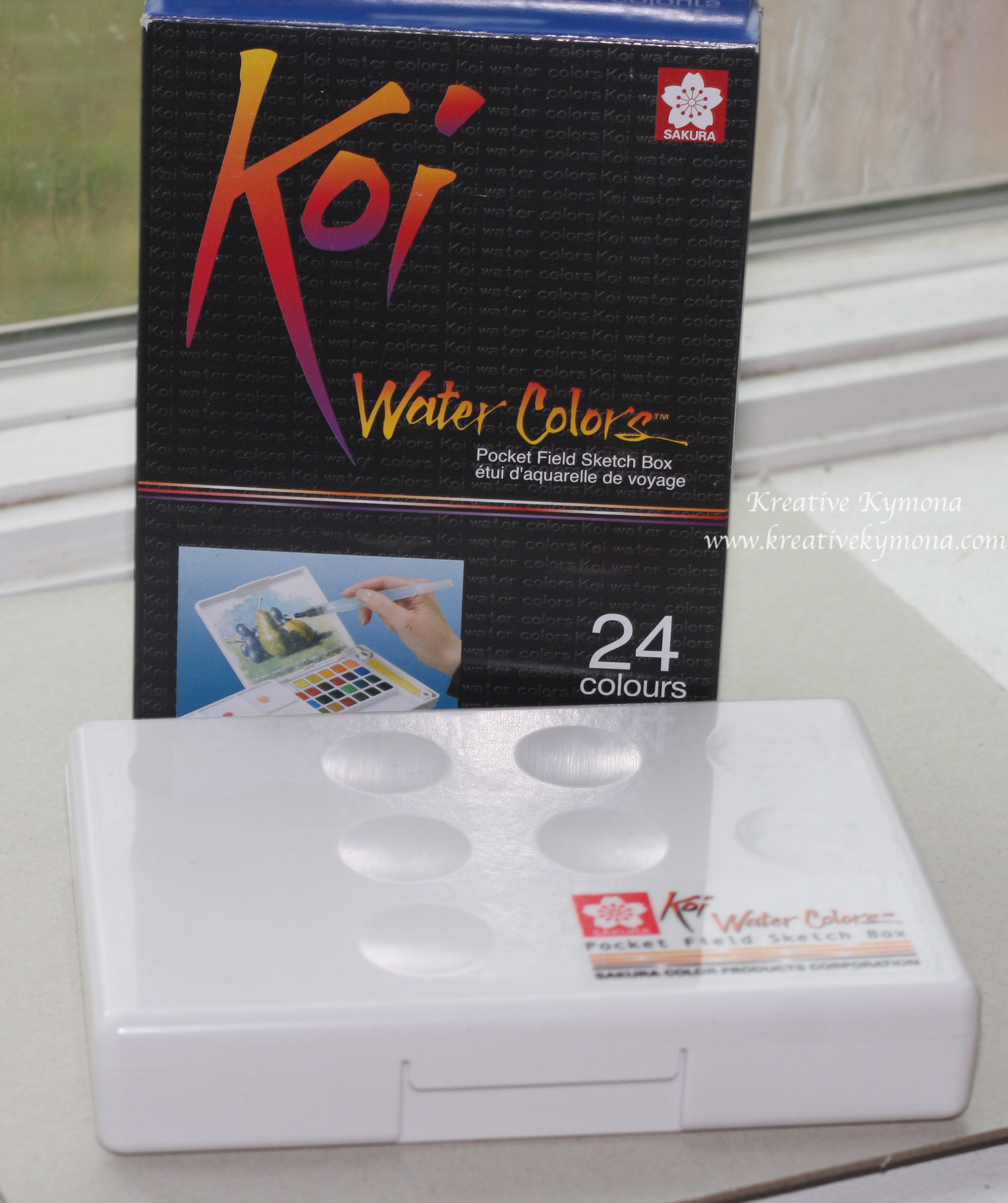
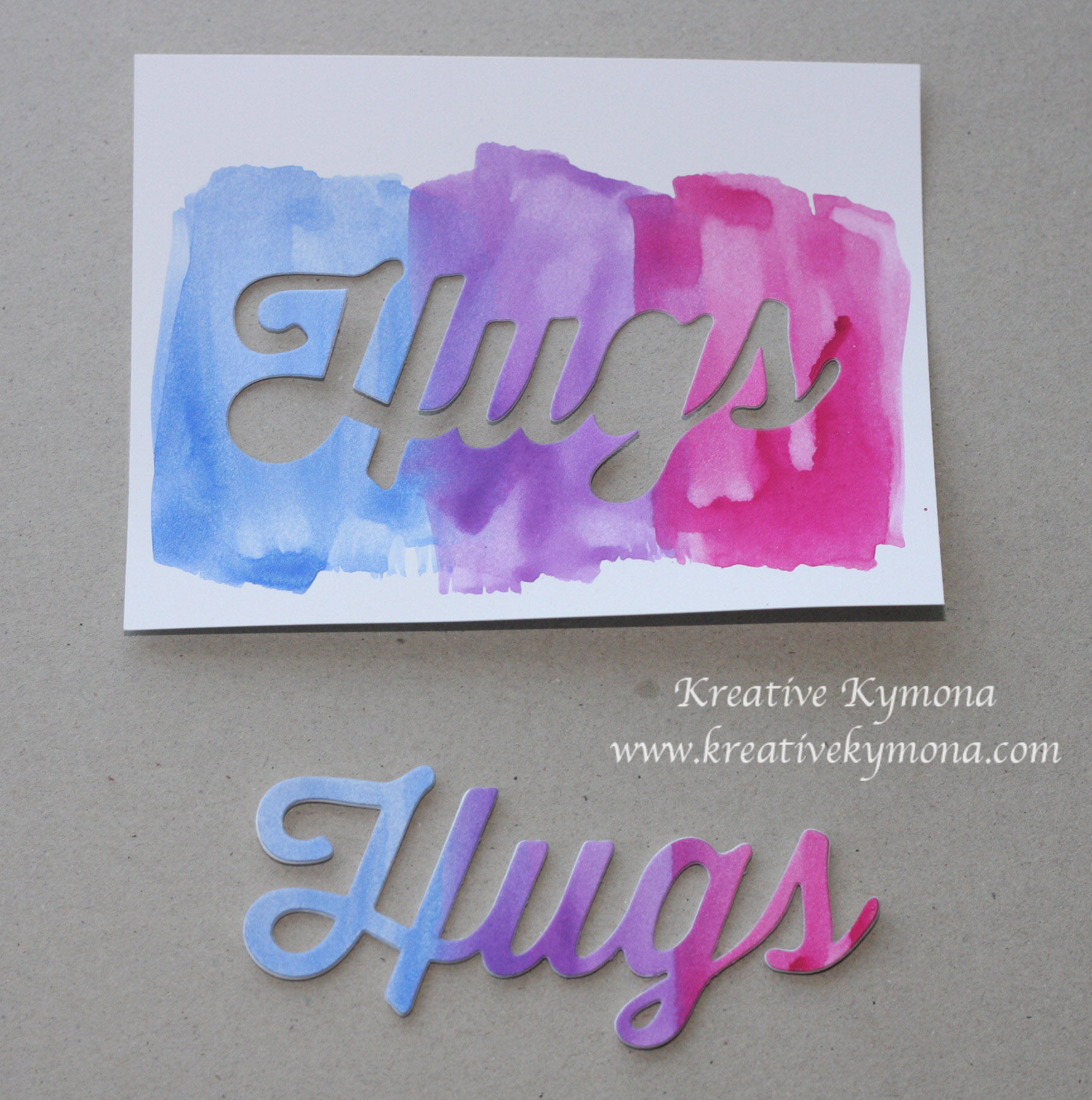
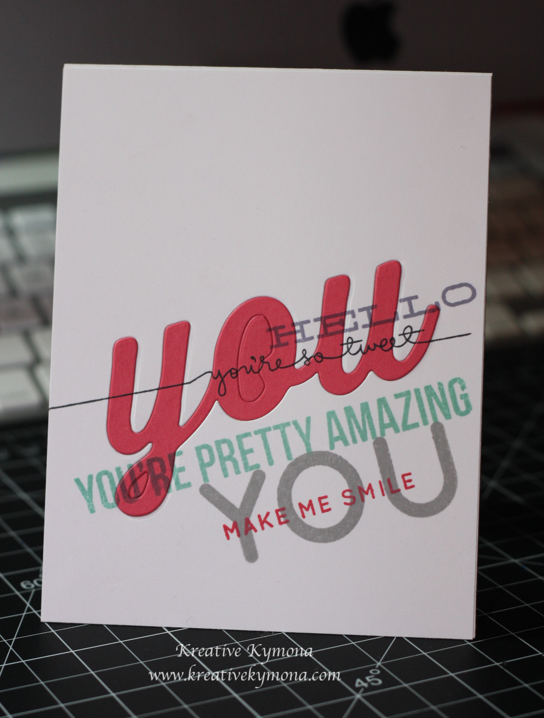
For my first assignment from Jennifer McGuire, I took my Pelikan Watercolor Opaque Paint Box and Big Hugs die cut and created a die cut of my mixed colors.  My watercolor set is from Germany.  They are made with highest quality pigments of the finest grain size.

This set includes hollowed paint tablets in the following colors: Black, Blue Green, Burnt Sienna, Carmine Red, Cobalt Blue, Cyan Blue, Flesh, French Green, Indian Yellow, Lemon, Magenta Red, Olive Green, Orange, Paynes Gray, Prussian Blue, Turquoise, Ultramarine, Umber Natural, Vermilion Dark, Violet, Yellow, Yellow Brown, Yellow Green, and Yellow Ochre. The color pans are interchangeable. A tube of Chinese White is also included.

Take a look:

Watercolor Hugs

I love these colors.  I used ultramarine, violet, and magenta red. They look so pretty together.  The Hugs die cut looks great.  It will look good on a card.  The negative space looks great too.  I will have to use that too.

My watercolors are opaque so it will take a lot of water to tune them down.  I run these colors over a black strip and you couldn’t see the black underneath.  I also embossed a sentiment with white embossing powder and applied these colors over it and you couldn’t see the sentiment, so be mindful of that.

My next assignment is to create a swatch for my watercolors.  I’ll post it as soon as I complete it.

I can’t wait to learn more about adult water-coloring!!!

Supplies used:

Pelikan Watercolorbighugsclassiccrestsolarwhtie

Please leave a comment, letting me know what you think.  I would love to hear from you.

-Kymona

Clean & Simple Card Class – Day 11 One Stamp, FOUR Ways

My online card class closes today and I wanted to post two more cards before they close the gallery.  Today’s class was about stretching one stamp set to create four different cards.  The technique that I used to make today’s card is called Bokeh Effect taught by Julie Ebersole.  Its a photography technique which refers to blur or a blurry quality.

Take a look at the photo below for an example of that effect.

"Blue is my color" captured by Edgar Barany

“Blue is my color” captured by Edgar Barany

See how the background is blurry.  That is the effect I’ve captured in the two cards that I made.  The layers of glitter on the forefront blurs the background.

Take a look:

I've Got Sunshine

Ready, Set, Go!

Ready, Set, Go! close up

I had a great time playing with this effect.  It was pretty easy to create and I can’t wait to try it with other stamps.  Both of the images seen above are from the same stamp set.  I have three other techniques to practice.

Please let me know what you think.

Supplies used:

Hero Arts Pale Tomato Ink

Hero Arts Pale Tomato Ink

Hero Arts Butter Bar Ink

Hero Arts Butter Bar Ink

Hero Arts Soft Pool Ink

Hero Arts Soft Pool Ink

Hero Arts Bubble Gum Ink

Hero Arts Bubble Gum Ink


Memento Tuxedo Black

Memento Tuxedo Black

Classic Crest Solar White CS

Classic Crest Solar White CS

Sticky Strip 104294

Sticky Strip 104294

ME Sunny Skies

ME Sunny Skies

Post-it Full Adhesive Roll

Post-it Full Adhesive Roll

Ultra Fine Crystal  Snow Glitter

Ultra Fine Crystal
Snow Glitter


Signature

Clean & Simple Card Class – Day 10 Textural Effects Part 2

So, I’m back again with another post on textural effects by Stephanie Klauck.  This second technique combines sticky embossing powder, glitter, and masking with a very clever twist.  I had fun trying out this technique.

Take a look:

Happy Birthday

  • To create the clean frame, I used washi tape to mask off the edges of the cardstock.
  • To create the shiny balloons, I used the heat and stick powder and a mask to add the different colors of glitter.

Let me know what you think of my embossed card.

Supplies used:

Classic Crest Solar White CS

Classic Crest Solar White CS

Worn Lipstick  Distress Ink

Worn Lipstick
Distress Ink

Birthday Balloons

Birthday Balloons


Coastal Cabana 131175

Coastal Cabana
131175

Strawberry Slush 131178

Strawberry Slush
131178

Blending tool

Blending tool


Heat and Stick Power 100625

Heat and Stick Power
100625


I also used random glitter, washi tape and a black pen for the balloon strings.

Signature

Clean & Simple 3 Card Class – Day 9 Textural Effects

In today’s class we learned a couple of different techniques that had textural effects.  The first one was Dry Embossing.  I’ve seen this technique before but haven’t really played around with it until now.  My card features a variation on selective dry embossing that leaves a portion of the design flat, while the remainder is embossed.

I was so excited about starting this technique, but quickly became discouraged because the embossing wasn’t coming out clean and crisped.  I tried at least five times before giving up.  Take a look at what I mean.

Textual Effect Mistake

When you look at the above picture you can see where the embossed image fades out and it isn’t suppose to.  The embossed image shouldn’t fade, it should only be in the area you actually want the embossed image.  So, I turned to my fellow classmates and teachers for some suggestions on what I’m doing wrong.  After trying again, I finally got it right.  Take a look.

Thank You textual effect

You can see exactly where I wanted the embossed dots and where I wanted a clean clear circle with no dots.  That’s dry embossing.  I’m so glad I was able to get this technique down pack.

What do you think?

Supplies used:

Classic Crest Solar White CS

Classic Crest Solar White CS

Perfect Polka Dots 117335

Perfect Polka Dots
117335

Big Shot Die-Cut Machine 113439

Big Shot Die-Cut Machine
113439


Tim Holtz  Embossing Diffusers

Tim Holtz
Embossing Diffusers

Another Thank You 133454

Another Thank You
133454

Strawberry Slush 131178

Strawberry Slush
131178


Coastal Cabana 131175

Coastal Cabana
131175

Wink of Stella Clear Glitter

Wink of Stella Clear Glitter


Signature

Clean & Simple 3 Card Class – Day 7 Creative Coloring Part 2

For the past couple of days, I’ve been so busy, that I haven’t been able to post a thing.   My online card class ended this past Friday and I have not posted my homework for 4 days.  I have so much to share.  So let me get right to it.

Today’s card is another card from day 7.  I love the creative coloring class so much, that I had to make another card using that technique, wait, another 2 cards!

This class taught us how to make clean and simple one layer cards.  When I started to create today’s card I was so excited that I didn’t realize it wasn’t a one layer card.  As a matter of fact, the card didn’t even have space for someone to write in it.  I thought to myself why, didn’t I realize that in the beginning.  I was busy creating that I totally missed it.

Take a look:

Birthday with heart

When you open this card the sentiment is left on the inside of the card.  The card looks nice but it isn’t functional.  The hearts where colored with the same Copic colors.So, I decided to make the card all over again.  The second card is a one layer card that is very functional.

Take a look:

Birthday with flower

What do you think? I like both cards but in terms of the clean and simple one layer, the second card is the winner.  Take a look at both of the cards together.  The flowers were colored and cut using the same Copic colors.


Birthday 2 Cards

Supplies used:

PTI Birthday Die

PTI Birthday Die

PTI Bitty Button Stacks Die

PTI Bitty Button Stacks Die

Tombow Multi-Purpose Adhesive 110755

Tombow Multi-Purpose Adhesive 110755

LF Hearts Cuts

LF Hearts Cuts


Basic Rhinestones Jewel Accents 119246

Basic Rhinestones Jewel Accents 119246

Big Shot Die-Cut Machine 113439

Big Shot Die-Cut Machine
113439

Classic Crest Solar White CS

Classic Crest Solar White CS


Whitegrain cardstock

White Woodgrain cardstock

Copic Markers

Copic Markers


The Copic colors that I used are RV66, BV17, YR16, BG49 and YR23.

Please let me know what you think.

Signature


Clean & Simple 3 Card Class – Day 7 Creative Coloring

I’m so excited about today’s class because we learned how to do some creative coloring.  I love coloring because it is so easy to do and it reminds me of my childhood.  Back then we were not worried about perfection and was happy with what our finally project looked like even if we went outside the lines!!!

The card that I made is sooooo cute!!!  Kristin Werner taught us how to do simple Copic coloring.  I’ve grown to love Copic coloring but have been afraid to use them.  I’m not sure why, they won’t bit.  Sorry I digress, back to today’s card.

Take a look for yourself:

Smile Die Cut

Doesn’t this card make you want to smile and keep smiling.  Anyone who gets this card will have a brighter day.  I will definitely will use my Copic markers to create more cards like this.  The colors I used for my card are RV66,BV17, YR16, BG49 and YR23.

Please leave a comment letting me know what you think of my Copic Colored “Smile”!

Supplies used:

Whitegrain cardstock

Whitegrain cardstock

White Vellum 101856

White Vellum
101856

Copic Markers

Copic Markers


Tombow Multi-Purpose Adhesive 110755

Tombow Multi-Purpose Adhesive 110755

Big Shot Die-Cut Machine 113439

Big Shot Die-Cut Machine
113439

Stampin' Trimmer 126889

Stampin’ Trimmer
126889


Into The Woods Mixed Sequins

Into The Woods Mixed Sequins

Hello Sunshine Mixed Sequins

Hello Sunshine Mixed Sequins

Quinns Capital ABCs Lawn Cuts

Quinns Capital ABCs Lawn Cuts

Hearts Lawn Cuts

Hearts Lawn Cuts


Signature


Clean & Simple 3 Card Class – Day 6 Graffiti Stamping

I have to say that I absolutely LOVE the card I made today for my homework.  I took my time and really put my heart and soul into this card because I wanted it so be super clean and crisp.  I’m still working on the backgrounds into the foreground.  Today’s technique is called Graffiti Stamping.  Graffiti stamping is when you create a background cluster of colors and layers. 

I have to say, the “You” die is my favorite.  I love the look it gives to the cards I’ve seen it on.  I’m so glad I was able to use it to make my card. 

Check out my one layer card graffiti stamped card:

You

So, I said in the beginning of this post, that I took my time and really pulled my card off with a crisp, clean look. Well, I do have a small error that I didn’t notice until after I was done and I couldn’t fix it.  Can you tell what the boo-boo is that I made?

The “strawberry slash” you has to pieces that should be white.  Inside the “O” and the loop in the “Y” should both be white.  Instead of placing the white pieces, I put the strawberry slash color.  The “You” is suppose to look like I wrote it on the white background, when we write those areas would match their background.  Although small it changes the look of the graffiti.  I still like it. 

I will make another card using this die and show you what I mean.

Please let me know what you think of my card in the comment section.

Supplies Used:

SSS Hello You

SSS Hello You

SSS Stripe Greetings

SSS Stripe Greetings

SSS Giving Thanks

SSS Giving Thanks


SSS Big You Die

SSS Big You Die

Classic Crest Solar White CS

Classic Crest Solar White CS

Strawberry Slush 131178

Strawberry Slush
131178


Coastal Cabana 131175

Coastal Cabana
131175

Wisteria Wonder 126985

Wisteria Wonder
126985

Smoky Slate 131179

Smoky Slate
131179


Snail Adhesive 104332

Snail Adhesive
104332

Stampin' Trimmer 126889

Stampin’ Trimmer
126889

Memento Tuxedo Black

Memento Tuxedo Black


Signature


Clean & Simple 3 Card Class – Day 5 Backgrounds Into the Foreground

Today’s class is my favorite of all time.  The different techniques that were taught today are amazing.  I’m going to try them all!!  I’m starting with the technique Laura Bassen taught us today.  I seen her do this a couple of times before but have never tried it.  I’m glad I’m getting the chance to to that.  The Masked Background technique is creating a background with masking..no need to use stamps to create this look.  I love it!

Take a look at my card:

You are a true friend

After I was done, I realized I didn’t leave any white space but I like it like that.  The pattern isn’t uniformed which looks great to me.  I have to admit that it wasn’t easy blending my inks together.  I had to press really hard to get the inks to really look uniform.  I will try this technique again using distress inks.  Laura did say they blend so much better.

So tell me what do you think of my plaid background card.

Supplies used:

classic crest solar white CS

classic crest solar white CS

Strawberry Slush 131178

Strawberry Slush
131178

Coastal Cabana 131175

Coastal Cabana
131175


Wisteria Wonder 126985

Wisteria Wonder
126985

Rich Razzleberry 126950

Rich Razzleberry
126950

Onyx Versafine

Onyx Versafine


Post-It Full Adhesive Roll

Post-It Full Adhesive Roll

SSS Hello You

SSS Hello You


Signature